|
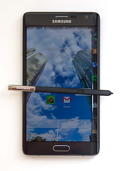
I'd say I'm playing devil's advocate, but that wouldn't be accurate. I'm not simply posturing or positing to create an alternative view from the naysayers who think the Samsung Galaxy Note Edge isn't worth the money. I think it is. There, I've said it. The curved display makes the Note Edge look much more attractive and eye catching than the Note 4. Looks are nice but utility is important for that Swiss army knife, the smartphone. The Note Edge's 160 pixel wide side display is indeed quite useful and it's the better vehicle to realize ideas Samsung had long ago, like the multi-tasking sidebar. Yes, it costs on average $100 more than the Galaxy Note 4, a phablet that the Note Edge completely mirrors in specs and features, including the S Pen. Clearly, the Galaxy Note 4 is already a very expensive phone, as is the iPhone 6 Plus--the Galaxy Note Edge is the same price as the 64 gig iPhone 6 Plus that's a simpler piece of technology. When the Note 4 costs $700 to $850, depending on carrier, what's another $100 for the Galaxy Note Edge? That's around 13.5% more full retail or $5 per month if you're financing it via a carrier payment plan. I'm guessing that many folks who are buying the pricey Note 4 have money to spend and are technology enthusiasts, and when you're spending $750, the jump to $850 might be acceptable. That said, for those who are tight on funds and are buying these phones on contract, then the Edge might not be worth it to you, since it averages a whopping $399 on contract, which is $100 more than the Note 4 and $200 more than average flagship smartphones like the Samsung Galaxy S5 and 16 gig iPhone 6 (except T-Mobile, they don't offer contracts anymore). The Samsung Galaxy Note Edge will be available on the big 4 US carriers.
The Tale of Two Notes
Samsung showed the world its two newest phablets, the Galaxy Note 4 and the Galaxy Note Edge, in early September of this year at the IFA tech tradeshow in Berlin and at an event in New York City. At the time, they didn't state pricing, though it was self-evident that the rounded display on the Note Edge would cost more. They didn't say when it would be available either, and it wasn't until mid-October that we found out Samsung had decided the Note Edge was a limited edition sort of model, with 1 million expected to ship in 2014 (and not all countries are getting it). I wouldn't be surprised if they widened their goals in 2015 if demand for the Note Edge is strong. Phone enthusiasts who tuned in to our and other sites' coverage of Samsung's announcement seemed to lean toward the Note Edge, since it was a more novel and clear update from the otherwise slowly evolving Note line. But the Samsung Galaxy Note 4, arguably Samsung's best phone yet, had a month lead on the Note Edge and with availability up in the air until recently, lots of folks grabbed a Note 4. This review is for those of you who haven't purchased a Note 4 yet, or are within your return period.
What's the Same?
Just about everything is the same as the Note 4, other than the curved glass display. The Samsung Galaxy Note Edge runs on the same 2.7GHz quad core Qualcomm Snapdragon 805 CPU with Adreno 420 graphics, 3 gigs of RAM and 32 gigs of storage. It has a strikingly good QHD Super AMOLED display running at 2560 x 1440 + 160, but the display is 5.6" rather than 5.7" (the main or flat portion of the display). It has a removable 3,000 mAh battery, microSD card slot, dual band WiFi 802.11ac, Bluetooth 4.0, NFC and a GPS with GLONASS. The phone runs Android 4.4.4 KitKat with Samsung's TouchWiz UI and apps added. The Edge 4 uses the same S Pen (Wacom) with 2,048 levels of pressure sensitivity and it has the same note taking apps.
What's Different?
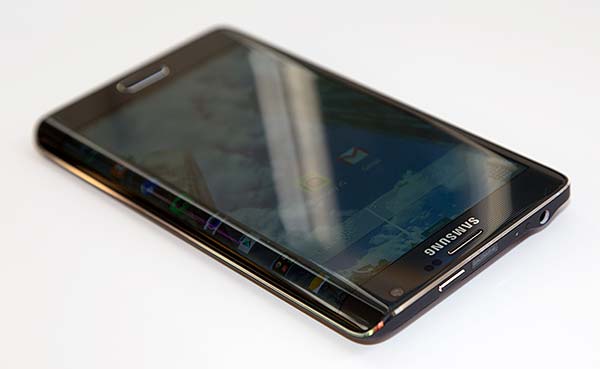
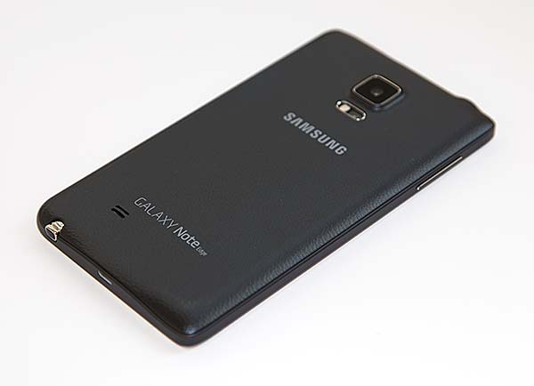
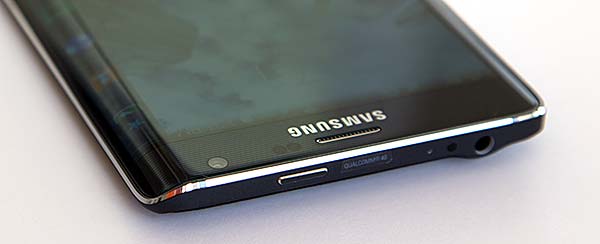
The Samsung Galaxy Note Edge has a one tenth of an inch smaller main display, a 200 mAh smaller battery (it's a shorter version of the Note 4 battery) and it's ever so slightly shorter and slightly wider than the Note 4. The power button is up top since it can't sit on the right side (there's glass there!). It has the same removable faux leather back (actually thin plastic) and metal sides, though the sides and back cover are necessarily designed a bit differently to fit the Edge's shape. For those who are interested in Samsung's Gear VR glasses, sorry it won't fit (those glasses are designed to house a Note 4).
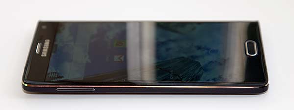
The star of the show here is the curved Super AMOLED display that gracefully seems to flow like a waterfall down the right side. The curve is very pronounced and it is indeed a single piece of Gorilla Glass 3 with a curved AMOLED display underneath. In order to create a bit of symmetry, the left side has just a little hint of a curve. Samsung says it's a very tech-intensive process to make the Note Edge, and I'd wager their profit margins are slimmer on the Edge because of this. It's simply lovely to look at and it bends the mind in a good way. The first time I saw it at Samsung's launch event I was taken with the stunning look, excellent viewing angles for both the edge display and main display and the useful widgets that ran on the edge display. You can have up to 7 widgets running on the edge display, and several are pre-installed. There's an app launcher that can hold up to 10 apps (you can select the apps), a second launcher screen that's not customizable on our T-Mobile version, speed dial, news, sports and stock tickers from Yahoo, weather, Twitter (sadly it's trending hashtags and not your own feed) and you can download more widgets. We downloaded the calendar widget and two games (all made by Samsung) and Samsung offers a developer SDK so third party developers can create more.
We're impressed at Samsung's execution: it's all well thought out and polished. Here are a few examples:
- The side display has palm detection so you don't accidentally activate something on the edge display. If you're tapping the main display it rightly ignores a simultaneous tap on the edge display.
- The phone's metal frame sticks out just enough so that it will contact the ground first if you drop the Note Edge and it lands on the curved glass side or its face. Still, I'd avoid dropping this expensive piece of tech!
- Wait, you're left handed like me? Though I actually find the phone usable in normal mode, it is more comfortable when held in the left hand, as a righty would. There's a 180 degree option you can enable so you can use the phone upside down, with the curve on the left. It's not as bad as you might think: I actually prefer the pen at the top and the power button at the bottom. What about the home, back and multi-tasking keys being up top? Samsung adds a small set of on-screen buttons at the bottom accessible via a little grab handle with virtual buttons. When 180 degree mode is enabled, it activates accelerometer-based rotation, so you can use it in normal and upside down modes simply by rotating the phone.
Color me impressed: I expected all sorts of quirks and usability issues, but Samsung has it all under control. The main screen doesn't accidentally bleed onto the side, nor does the side bar ever intrude on the main screen, though refraction through the apex of the curve might make it look like a window is extending beyond the divide. Since it's all one display rather than two discrete units, it's all handled via firmware and software. Several of the built-in apps make use of the side screen, for example the video player controls are on the edge display so they don't cover your movie. S Note's buttons are on the edge as are the camera's. You get a more uncluttered view in these apps, and thanks to the shortcuts launcher widget, you don't need a gaggle of icons on your home screen. It also makes multi-tasking easier and quicker. You know that sidebar Samsung's used with previous Note models that you bring up by pressing and holding the back button or by leaving a little drawer handle exposed? Everyone seems to like the multi-tasking idea but many folks complained about the little drawer handle blocking app windows. This is the perfect solution: a side display that doesn't interfere with the main attraction. Third party applications can add support for the edge display if they wish, and we'd love to see Evernote, the webkit web browser and even games do so.
But wait, there's more: swipe down on the edge screen and you'll be greeted with 5 handy utilities: a ruler, stopwatch, timer, flashlight control and the voice recorder. Swipe back and forth along the length of the edge display when the phone is sleeping, and just the edge display will come alive for interaction. There's a scheduled bedside clock mode (you can have it active for up to 12 hours per day) that shows you the time and temperature. When a call comes in, the notification and action buttons appear on the edge display rather than blocking whatever you were doing on screen. It's all very cool and generally speaking it makes the phone more expedient and pleasant to use.
|
Deals and Shopping:
Advertisement
|

