|
Home > Gadget Reviews > Moto 360 Android Wear Smartwatch Review

Moto 360
Editor's rating (1-5):    
Manufacturer: Motorola
List Price: $249.99 |
|
|
What's Hot: Best looking smartwatch currently on the market. Seamless Android notifications piped to your watch.
What's Not: Big and thick! Battery life is poor.

Reviewed September 16, 2014 by Lisa Gade, Editor
in Chief (twitter: @lisagade)

|
|
I'm not a grumpy person. I love technology. So why is it that after using the Moto 360 smartwatch, the latest nifty gadget that's supposed to make life easier, if not better, that I'm grumbling? I've spent days coaxing and cajoling my $250 watch to actually show me the info I need. I've had to read the manual on how to revive a truculent frozen timepiece. You loquacious types; you'll like this watch. You're supposed to speak to it rather than touch it. Sure, you can touch it after you've memorized a simple set of swipe and tap commands, but there's no palette of icons or instantly obvious ways to do things with touch. There are times when I don't want to act like Maxwell Smart and bring my watch up to my face and tell it what to do. That's not polite or permissible in meetings, at the movies, when having an intimate dinner or in class. I talked to my Moto 360 when on a plane, and I seriously thought the person sitting next to me was going to hit the panic button for an airline attendant.

In favor of the Moto 360 and Android Wear in general, voice commands and Google Now integration are excellent. It's simply simple and way cool that I can ask my watch to convert 46mm to inches or tell me what's the capitol of Wyoming. My Android phones do a good job of voice recognition, but the Moto 360 is excellent. It doesn't understand some proper names or non-Anglo names well though, and that lead to repeated attempts of trying to send a message to our senior editor, Tong, turning into a message to "tongue". I tried to send a message to Lisa, and that worked fine... well until we got to the message body when it said the microphone wasn't available. Huh? Yes, this is a very first gen OS, and Android Wear feels beta. The app selection is thin right now, but that will probably improve over time, assuming that enough Android Wear watches sell to make it worthwhile for developers (currently the Moto 360, LG G Watch and Samsung Gear Live are the only Android Wear Watches on the market).

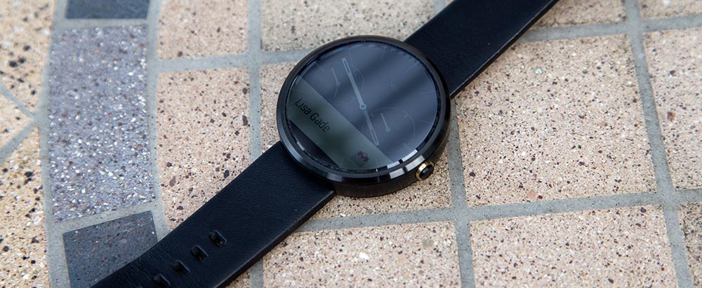
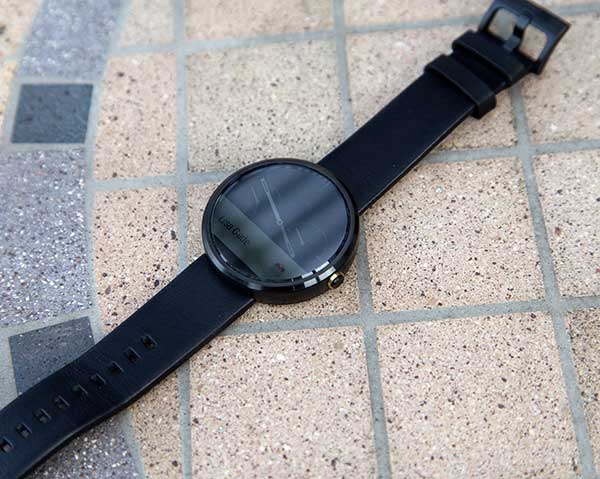
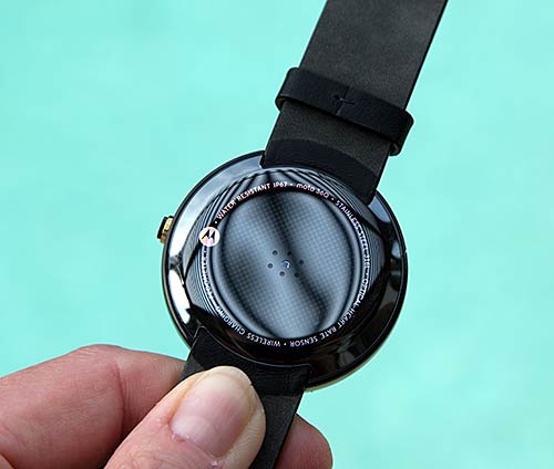
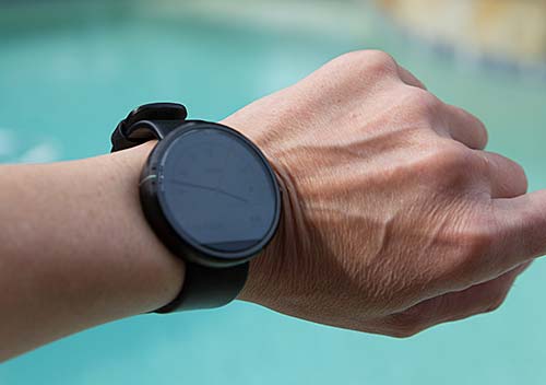
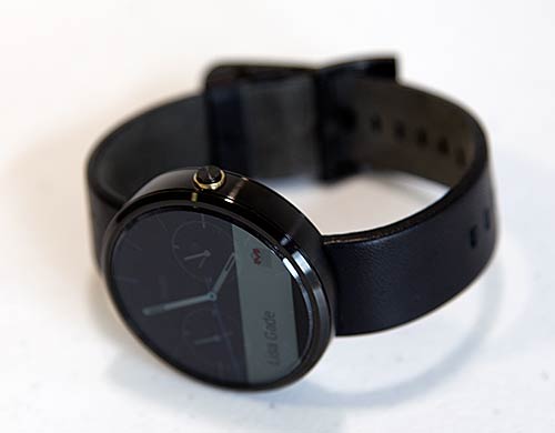
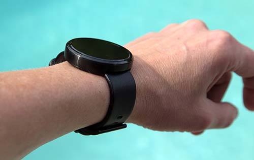
Some folks have heaped considerable praise on the Moto 360, largely because it's the first smartwatch that isn't darned ugly. It has a Movado-like minimalist elegance, only chunkier. It's also less thick, but at nearly a half inch (thicker than some smartphones and tablets), it's not nearly as slim as a normal watch. I've banged it into doorjambs a few times since it sticks out from my wrist so much, but happily the stainless steel frame and Gorilla Glass 3 face are very robust. Thickness aside, it is indeed the best-looking smartwatch currently on the market, and it's the only one that bears a strong resemblance to a traditional watch. The face is round so it doesn't look like a mini computer on your arm. It comes with a Horween leather band (your choice of black or dark gray), and metal bands are coming for $80 additional. The watch itself is available in all black (that comes with the black leather band) or with a stainless steel finish rim (with the dark gray leather band). You can use other bands, but Moto recommends letting your jeweler do the band swap. The watch face is huge compared to most conventional watches, and I suspect it's too large for most women. I'm a 5'10" woman with decent sized bones, and it looks OK to slightly absurd on my wrist. That watch display measures 1.56" and the watch diameter is 1.8" (thanks for the 46mm to inches conversion, Moto 360). One thing I can't say for that Movado watch: it isn't water resistant up to 1 meter immersion in water. Safe to do the dishes yes, but that nice leather Horween band isn't something I'd shower or exercise vigorously with.

|
Deals and Shopping:
Advertisement
|
|
Moto 360 Video Review
Android Wear watches like the Moto 360 require a companion Android phone running Android 4.3 or later. Unlike the Samsung Gear and Samsung Gear 2, it doesn't require a particular brand of phone, though you'll get one extra feature if you use a Moto phone (trusted device that keeps your phone PIN unlocked when in range of the watch). The watch communicates with your Android phone using Bluetooth, which has a range of approximately 30 feet. When not in range, your Moto 360 can tell the time and provide both heart rate and step counter info, and that's about it. Everything from data feeds to third party app stuff is really handled by your phone. Stock feeds, weather info and all other Google Now cards come from your phone and are delivered in bite size chunks on the watch display. Unlike Samsung's Tizen-based Gear and Gear 2 smartwatches and Apple's upcoming Apple Watch (due out in early 2015), there are no discrete apps or icons to tap and bring up info, play music or create content like notes. If there's no Google Now card on the display, you'll double-tap on the watch face to do stuff like create a note, send a message, check your calendar or get your sports team's standing. You do this by speaking to your watch, though there's a scrollable list of possible commands that allow some touch interaction (hint, at some point it will insist you speak).
|
Advertisement
|
We applaud Motorola for creating a gorgeous selection of watch faces. You can press and hold a finger on the watch face to swipe through the 6 available faces, or use the Android Wear app on your phone to do the same. There are black and white analog faces, two digital faces and one with two world clocks. For some reason, the date is shown on only one face (white analog). The 320 x 290 display is bright and legible outdoors in sunlight and it has an ambient light sensor so it won't burn your retinas when you check the time and messages in a dark theater. By default, the watch display turns off after a period of time and using the usual turn your wrist and raise your arm gesture to look at it will turn the display on. You can set it to be on all the time (it still dims markedly), but that will significantly reduce battery life from 14 hours to 8. Did you notice that though the face is round, the pixel dimensions aren't equal? That's because the watch face is really more of a flat tire: a small portion at the bottom is always black because Moto had to put some of the hardware in this spot. The design alternative was a bigger bezel or an even thicker watch. Some day technology will catch up to our dreams and needs, and these compromises won't be necessary. For now, this is the price you pay for having a retro TI OMAP 3 processor and bright display with ambient light sensor on your wrist.
While the Android Wear competition is rocking on the thoroughly modern if not overkill Snapdragon 400 quad core CPU, Moto decided to go with the antiquated and power hungry OMAP 3 CPU from 2010. In practice, given how little processing is handled by the watch, it doesn't make a huge difference. That said, I noticed lag compared to the Samsung Gear Live, and occasionally the "OK Google" voice commands got a little behind where I was,which was annoying. Overall, the watch feels decent but not awesome in terms of speed.
The watch lacks a GPS, but it can use your phone's GPS and Google Maps to get directions, one step at a time, to your destination. Since there's no speaker, it won't give you voice prompts, making it better for foot travel than driving, though it defaults to driving directions. Since your phone needs to be in Bluetooth range of the watch, the good news is that it will likely be close enough to hear its spoken directions.
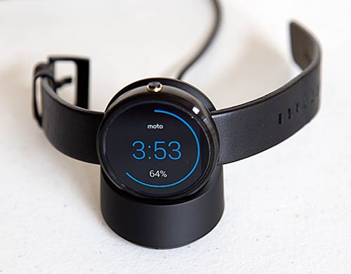
Android Wear isn't like Samsung's first Android (just Android, no Wear) watch the Galaxy Gear or their updated Gear 2 and Gear 2 Neo that run Tizen, Samsung's smartphone OS. It's not designed for standalone use in terms of entertainment, so there's no photo viewer or music player. In fact, the Moto 360 vibrates in a tasteful and not jarring way, but it has no speaker. Call it the "Quiet One". That means it won't play alarm tones to wake you up, even though when cradled in the included elegant Qi inductive charger, it makes a perfect bedside clock. Nor can you use it to carry on phone calls. For those who believe watches should be seen and not heard, it's perfect. I suspect many of you would like to rock to MP3s or have it make noise to wake you in the morning though.
That leads to your idea of what a smartwatch should be. Largely, they're all simply remote screens for your smartphone. They do less than your smartphone and as with Android Wear and the Moto 360, at some point the watch will tell you to follow through with the task on the phone if you need to do more. If you simply want notifications of new texts, emails (including Gmail) and upcoming appointments; the Moto 360 does the job well. It will tell you the weather, keep tabs on your heart rate throughout the day and count your steps. You can even use it to answer calls: swipe the green ball to answer or red to ignore--then pull your phone out of your pocket real quick to start speaking (ahem). It has a bright and colorful touch screen, good voice recognition and it's the most stylish smartwatch shipping. The Pebble Watch, particularly the attractive Pebble Steel model priced at $229 has been popular and it works like a passive information gateway just like Android Wear, so clearly some of you just want to have information on your wrist.
Others want more for $250: photo viewing, video playback, a music player and heck, maybe even a camera. Right now, Samsung's Tizen OS Galaxy Gear, Gear 2 and Gear 2 Neo would be better picks since they're designed to entertain you rather than just quietly deliver information tidbits. And then there's the Pebble watch with its non-touch e-ink display and wide selection of apps that work with both Android and iOS. Lastly, there's the Apple Watch, which looks very promising: it's reasonably attractive, comes in two sizes and 3 finish levels, offers notifications and some standalone entertainment and communication options like sending finger-drawn images to pals. But it requires an iPhone and won't be out until 2015. In the meantime, the Moto 360 is good looking and we hope Google and third parties add apps that make the watch feel like more than a remote screen for your Android phone. Right now, we feel like we're 6 months early to the party.
Website: www.motorola.com
Price: $249.99 with leather band, metal band will be $80 more
Related Reviews:
Moto 360 (2nd gen, 2015)
Huawei Wach Review
Apple Watch Review
LG G Watch R Review
Asus ZenWatch Review
Samsung Gear S Review
Samsung Gear 2 Review |


|
|
Specs:
Compatability: requires any Android phone running Android OS 4.3 or later and the free Android Wear app installed on the phone.
Display : 1.56". LCD touch screen with ambient light sensor. 205 PPI. Corning Gorilla Glass 3.
Dimensions: 46mm x 11.5mm (1.8 x 0.45 inches). Weight: 49 grams (1.73 ounces).
OS: Android Wear.
CPU: TI OMAP 3 CPU. 512 megs RAM, 4 gigs storage.
Camera: none.
Durability: metal watch body, IP67 certified for dust and water resistance.
Wireless: Bluetooth 4.0 LE for communication with Android phones.
Sensors: gyroscope, accelerometer, pedometer and heart rate sensor.
Battery: 300 mAh (according to battery's label, but Moto describes it as 320 mAh).
|
|
|
|

