|
|
|||||||
|
Home > Gadgets > Photography Tips
5 Photography Tips to Improve Your dSLR and Phone Photos
Posted February 19, 2015 by Lisa Gade, Editor in Chief (twitter: @lisagade)
|
||||
|
We review quite a few cameras and smartphones with capable cameras, but what do you do with that great gear after you've purchased it? This article is for novices--if your dreams are filled with photo ops in Brunei with Leica in hand, you know f/1.2 from f/11 and how to use them and are mastering advanced lighting in your photos, then you likely know these points. The things we cover here apply equally well to dSLRs, point and shoots and camera phones. 1. The Icarus principle: Don't shoot into sun or backlight your subject unless you're going for a special effect like the sun setting behind mountains. Unless you want your subject to be in the dark and her surroundings well lit, avoid placing your subject directly in front of the sun. Move to the side or into a lightly shaded area, but watch out for striped shade that can leave your subject looking mottled. Now if you're shooting a palm tree silhouetted by a low, red sun then go for it! Modern HDR can help with extreme exposure issues caused by backlighting your subject, but you'll still get better details and color if lighting is coming from the front or side (again, this doesn't apply to art shots where you're using the sun as your own high intensity spotlight for visual effects).
2. Don't shoot portraits at wide angle. Portrait lenses are typically 90mm or 60mm for a reason--use that zoom ring to zoom to 50mm or greater when shooting your spouse so she doesn't grouse. If you have no choice as with a camera phone (those all have wide angle lenses), then step back to avoid the fish-eye like distortion that up close wide-angle portraits induce.
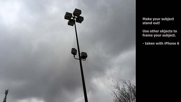
3. Rule of thirds and composition--lots of folks see this one and take it too seriously. Here we divide the photo frame into three equal areas both horizontal and vertical. The idea is to create a sense of movement and set the focal point of your photo in a corner for more visual interest and movement (the eye follows across the frame to the point of interest). Also you'll use it to decide where you want the horizon line. Take all that with a grain of salt. Portraits look great centered, as do photos of pets up close. But in our photo of a lamppost in a parking lot, you can see how the smaller tower on the lower left balances the placement of the lamp in prominence on the right and a tree at the bottom right frames and gives perspective. For landscapes, architecture and art style object shots, the rule of thirds and object placement off to the side work well. Use lines to bring attention to your subject in landscapes. For example, use the converging lines of the two rows of parked cars to move the eye a centered supermarket.
|
Advertisement |
|||
|


